The Center for Children and Families (CCF) at Georgetown University’s Health Policy Institute wants to help bring “high-quality, affordable health coverage” to every child and family in the country. Interpreting data sources on Medicaid, the Children’s Health Insurance Program (CHIP) and the Affordable Care Act (ACA), CCF publishes research papers exploring health access issues facing low- and moderate-income families. Over the last year Alley worked closely with CCF to redesign their site, with an emphasis on making their site mobile-friendly, adding interactive tools to understand state and national health data, and creating ways to feature their research reports.
Redesign

The goal of the site’s redesign was to help Georgetown’s audience quickly find the health policy information they’re seeking, so there was a heavy emphasis on organizing the site structure around terms like Medicaid, CHIP and Emerging Issues. Our team also designed a clean, organized look for their Say Ahhh! blog so readers could easily find recent updates.
Mobile-friendly
CCF’s previous site was difficult to navigate on a mobile device, so the Alley team made a concerted effort to build a smart layout that works for all devices, including desktops, tablets, and mobile phones. The new site is fully responsive, so anyone can read more or discover policy insights from any internet-connected device, no matter where they’re located or what size screen they are using.
Interactive elements
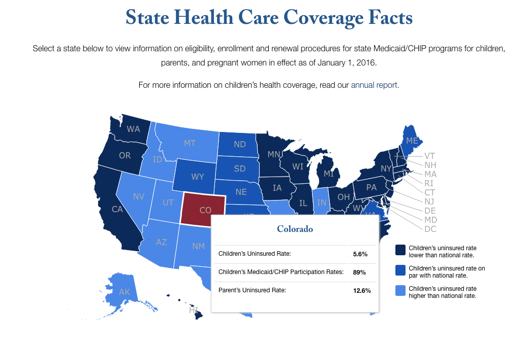
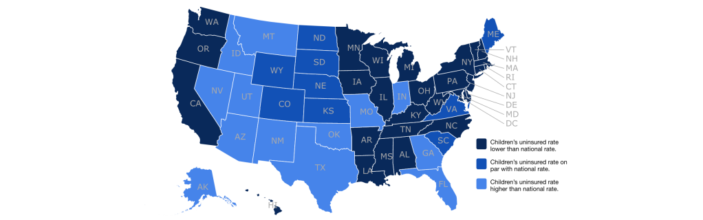
Alley’s Data Science team designed and built a state-based map to visualize facts about health care coverage of children in each state. The interactive map uses a visual categorization system to easily show which states have a higher, on par, or lower rate of uninsured children compared to the national average. If you hover over each state, you can also see specific information about that state’s uninsured rate for both children and parents, as well as the state’s participation rate for Medicaid and CHIP. Data populating this map can easily be updated by the CCF team using the WordPress backend, and the algorithm governing the map has the option to automatically adjust the averages whenever new information is added.
Orson Bradford, of Alley’s Data Science team, notes that the map allows the reader to drill down and discover specific numbers about each state. “The custom map leads the audience to more information on each state detail page. Just click through the map on a particular state, and the resulting page extends and complements the map data by comparing each state’s income eligibility levels to the Federal Poverty Level. The people at Georgetown CCF knew exactly what they wanted to show, so we built the interface to allow them to populate the data and have everything automatically display correctly.”